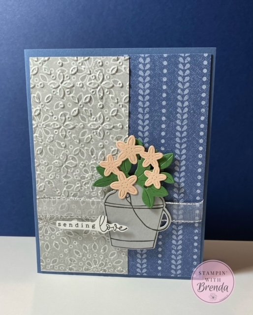
When I opened the package of the new Stampin’ Up! Country Lace designer series paper (DSP), I admit I was expecting some texture because the image was so crisp and clear! So when I went to use it for my card for class this week, I thought I’d do something about that!
Another great new item is the Eyelet 3D Embossing Folder.
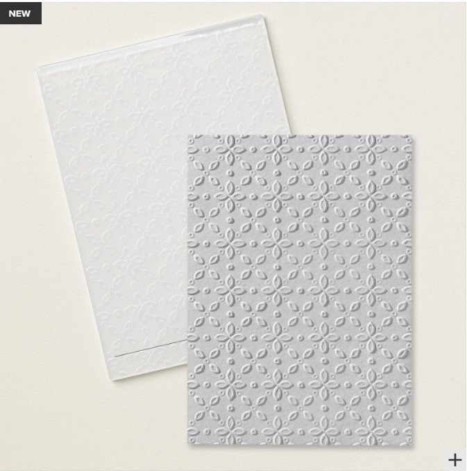
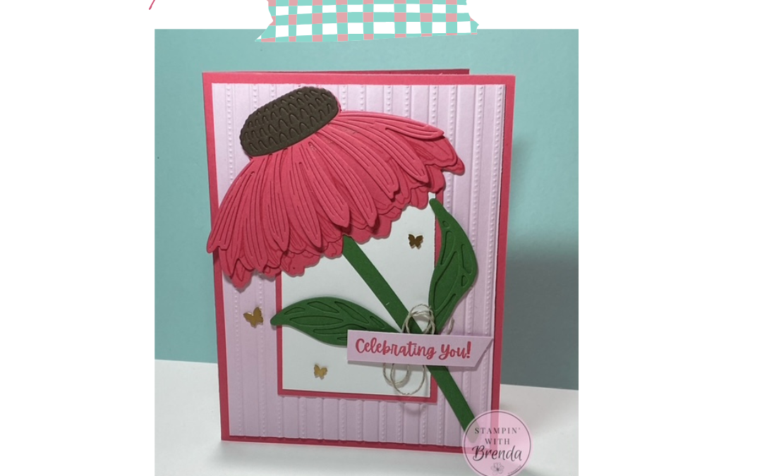
While the design is NOT the same as those in the Country Lace DSP, I decided to see what it would look like if I used them together. I loved it! No, it doesn’t line up (which is a bonus to me as I’m not so good at that!!), but it gives the illusion that it does (at least to me!). I’d love to hear what you think!
Here’s the link to the Quick Class video. I neglected to use the ribbon on my card in the video (actually, there are several unfortunate mistakes in here, like no video (only sound) for the first minute or so), but the gist of the card is there.
This is also one of the cards featured in my May Stamp-a-Stack classes. For info about my upcoming in-person and virtual classes, check out my class descriptions here and my calendar here. For more ideas every month, be sure to sign up for my weekly newsletter at the bottom of this page. Thanks for checking this out!
Country Lace Card Measurements:
- Misty Moonlight card base – 8 1/2″ x 5 1/2″ folded at 4 1/4″
- Country Lace DSP – 5 1/4″ x 2 1/4″ (lace design), 5 1/4″ x 2″ (stripe design)
- Basic White – 4″ x 5 1/4″, 1/2″ strip
- Garden Green & Petal Pink scraps for die cutting
- Smoky Slate – 2″ x 2″


0 Comments